Thursday 18 December 2014

Magazine Advert Final


This is our final magazine advert. The idea for this was a joint effort from everyone in our group. In order to produce it we took ideas from everyone's original ideas. As you can see, we have incorporated parts of each team members advert into our final product.

We have used a consistent font throughout all of our products, this is good because it links all of the media texts together. It gives a sense of intertextuality. The font on our magazine advert is good because it also links in with the theme of our music video, whilst also challenging stereotypical conventions of this genre.

The image used in the background was one that we took during one of our shoots, it is an action shot that looks as though Connar is walking away from the camera. It is effective as it makes our audience want to see more, and therefore effectively advertises our music video. Also by the image being very open, it leads the audience to want to know more, enhancing them to go and watch the music video. This therefore makes the image a very good one to use on an advert as it does make people want to watch the music video.

We have included other key information on the advert, this includes the website address, iTunes logo and the record label for our artist logo. By including all of these it makes the advert look very professional. It adds a sense of realism. Based on audience feedback we did change these from the original version, we were told that originally they were too big and needed to be reduced in size, therefore we took this into account and made them a lot smaller. This is the final product, once audience feedback had been considered and changed.

By Jack, Calum, Rhys and George

Digipak Final

 
This is the final product we have created for a Digipak. We stuck with our original theme of the woods and forest which have been incorporated into our plans and featured in our actual music video. We did this because it created connection between our music video and ancillary products. We used abstract shapes around the front cover title because after researching the genres album art it was a common denominator. We used pictures of our characters on the Digipak so that it portrayed the importance of the characters to the music video.

By Rhys, Jack, Calum and George


Wednesday 17 December 2014

Final Cut: Trials of the Past Music Video

This is our final cut of our music video. We have added in various different things based on personal opinions and also based on feedback received from our target audience.


The first noticeable difference between our final version and the initial two cuts, is that the use of black and white is more purposeful, we changed this based on audience feedback. Prior to this, the effects had been used very sporadically and that meant that the audience did not really understand why it was being used. The main reason for the black and white is to distinguish between reality and dreams. The black and white connote this to the audience and as a result the audience can understand what is happening.

Also in this version we have a lot more location shots, again this was based on audience feedback from the first two versions that we had done. The audience wanted to see more of the location, this was beneficial to us and the audience because it meant by doing this we could build on strengthening the narrative to make it obvious what was happening throughout, all the way until the end of the music video. The location shots also meant that we could show off our camera skills, we have used a range of shots, long shots, close ups and even establishing shots of the moon with the trees in the way.

Another difference is that we have added another character. This was quite a large change that we considered late on. The reason for adding the second character is that we had to add more depth to our narrative rather than just having one character who may be lost and can't find his way home. Adding a second character really aided our narrative and made our whole video more interesting and captivating to watch. We did away with the fatal ending which we thought was too severe and not shot properly and incorporated the idea of a recurring dream instead. We are pleased with our final cut and like the way it has come out.

By Jack, Rhys, Calum and George

Monday 15 December 2014

Rough Cut 2


This is our second rough cut. After receiving feedback from our first rough cut we amended some of the things that were wrong in our music video. However, there are still some things which need to be changed and we need to film more footage to add to the narrative of the music video, to make it clearer.

Feedback 

 Teachers

Concept and narrative aren't clear - doesn't show an "excellence in shooting material" 

Needs to include more location shots to emphasise where he is throughout the video 

Needs to show a closer attention to Mise-en-scene

More continuity - needs to be either walking or laying 

Include the concept of the recurring dream

We decided to get feedback from teachers separately as well as peers because then we would have more detailed feedback so our next rough cut could be as good as possible. 


Students

I like the mixture between black & white and colour shots, although there could be even more black and white

The ending could do with improving as being hit by a car seems unrealistic

Some unwanted audio is still there - you can hear somebody say "do it slowly yeah"

It may be a bit far fetched but you could include another character to make the narrative clearer

The feedback from students, paired with our feedback from teachers has given us more detail to work on.

By Jack Jolly and George Martin

Rough Cut 1


This is our first rough cut of our music video. As our first attempt there are some things which need rectifying however I am pleased with how much footage we have managed to include and our use of lip sync footage. There are some things which need to be addressed which have been notified to us buy our feedback representatives.

Feedback

The video needs to be longer as it suddenly cuts off during the song.

Some of the lip syncing is slightly out of time, making it unbelievable that the character is the artist.

The black gaps in between clips need to be filled in.

It would be easier to understand if there was a clearer narrative - is there a defined ending or is the video just going to end ambiguously?

There is a shot early in the video where a car can be seen passing in the background - this makes it seem unrealistic as why else would he spend the rest of the video trying to make it out of the woods.

There needs to be greater continuity in the colouring of clips, as the actors skin appears to be darker in some shots than others.

We are going to take on this feedback and amend the things which have been suggested.

By Jack Jolly 

Thursday 4 December 2014

Final Props Decisions

Despite initially planning to not incorporate any props into our video (we believed that the setting of the woods would make it unrealistic), we eventually decided to incorporate some props in order to present a more obvious relationship between the two characters shown. These props were added in between the second and final cut of our video, as this is when we received the feedback that it would be a stronger video if a second character was included. The two props we decided to incorporate were a mobile phone and a wedding invitation, and both are included around the same time within the video in order to present the close relationship between the two characters.
The mobile phone is effective because it shows a picture of the two characters together, which is clearly an old picture - this adds a huge amount of narrative focus to the video because it shows the audience that there is some sort of history between the characters. In addition to this, we decided to include this prop as it meant a change in shot composition as almost all of the other shots are either focused on a character or on the scenery surrounding the woods. It is also a much brighter shot than nearly all of the others within the video, meaning that it provides a break from the otherwise incredibly dark video.


The other prop we used, the funeral pamphlet, helped us to add to the dark and scary ambiance of the video. This is because it connotes that the second character in the film is already dead, thus linking with the lyrics of the song which are all about ghosts and the past. Without incorporating this prop there would have been little linking the visuals with the music, which again would have greatly affected the narrative of our video.


Overall, I believe that these choices of props are effective and will help to give a much stronger narrative aspect to our video, along with providing us with a wider range of shooting material.

By George Martin

Tuesday 2 December 2014

Shotlist for digipak

Our digipak will require real images that we have taken ourselves. This means that I need to create a shotlist for the images that will be used.

The digipak consists of 6 panels so each panel will require a different shot. We are also using some black backgrounds which will not distract from the text of the tracklist and record labels etc.


This is an example of the sort of image we will be taking. I think it is best to take a photograph of the forest in which we are filming so the locations connect and then our products will also connect.


Another example of the image we want to use is our star in the middle of the forest, our idea is to shoot it from behind so that you cannot see his face, this adds to the enigma, ambiguity and mystery of the digipak.

Shotlist

1st shot: The first shot will be of the forest in an establishing shot. This is for the back cover and potentially some of the inside of the digipak.

2nd shot: The second shot will be of our actor standing in the woods with his back to the camera. This will be an establishing shot also because his whole body will be in the image.

3rd shot: Another idea we had was a close up of our actor but with shadowing on his face for the front cover. We thought of this because it is something different so we have options to choose from. We could do this with a torch.

4th shot: We are going to shoot a distorted image of just our actors body parts separately and then put them together in different places of the image. This will also require photoshop but it is a good idea for a front cover because it is ambiguous as well.

5th: The final shot we could use is the close up of a tree, perhaps from a low angle to show the tree progressing up to the leaves. The low angle gives a distorted feel to the shot and connects with our theme.

This shotlist will be useful when taking the photos for the digipak. I will have this with me when shooting the digipak for guidance.

By Jack Jolly 
 

Monday 1 December 2014

Shotlist for magazine advert

The main focal imagery of the poster we design as a group is going to be a long shot of the open area of the woods which are featured within the music video, with our protagonist standing in them. It is going to be framed in order to just show the bases of the trees, and there will be a harsh light in order to create a lot of shadows around the protagonist, helping to mirror the bright look which the music video will have. Below is an example of a picture which we could have, although it would be filtered in order to make it match the black and white feel of the video. 
 
However, there are also a few other ideas which we considered photographing in order to make our magazine advert. An example of one of these is a mid-shot of the character who is featured within the video, similar to the one employed within magazine adverts such as the one for The Sound Of The Smiths. This could be effective when tied in with the music video, as the potential fan of the music will possibly recognise the artist from the video and thus will be instantly drawn towards it.
Shotlist
  1. Establishing shot of the woods - to be taken in multiple locations and at different times of day, perhaps with the idea of layering them up to create more texture.
  2. A close up shot of our artist, as we may use this as the focal point instead.
  3. A mid-shot of the artist, similar to the one on the poster which can be seen above.
  4. A mid-shot of the artist in a different costume, to play on the idea of "the past" which runs throughout the video. This could be edited in order to provide two different characters within the poster, to show that the song is about somebody being haunted.

By planning out the shots which we wish to include in our magazine advert, we will be able to be a lot more efficient in both the exposition and composition of our advert.

By George Martin

Sunday 30 November 2014

Equipment Information

The two main pieces of electronic equipment which we will be using within the production and post-production of our music video are a Canon HD CMOS Pro camera and an iMac as a workstation to edit the video on. However, we are also using pieces of physical equipment such as tripods and dollys in order to make the video as technically perfected as we can.

Camera
We chose to use to use the Canon HD CMOS Pro as it intelligent auto-focus feature, which allows us to set the camera on the subject and then allow it to keep the shot in focus for us. This will save us from having to constantly adjust the manual focus in order to keep the shot crisp with the foreground and background clearly separated.

Computer
The computer which is being used to edit on is a 2010 21.5 inch iMac with 4GB of RAM, as this is ample in order for us to run iMovie and Final Cut, which are the two programs we are editing with.
We chose to use a Mac instead of a Windows due to both the wider range of software available, and the more coherent user interface which allows us to edit music alongside the video. We are using iMovie in order to piece the video together, and Final Cut in order to recolor the footage, as these are the areas which both of these programmes are strongest in.
 

Tripod
The tripod was used in nearly all of the shots, as it allowed us to keep the camera completely stable which gives a much more professional look to the video. However, I do believe that we should have brought some taller tripods with us as well, as it was fairly difficult to do the birds-eye view shots without having a tripod which was much taller than our actor. Along with filming with the camera on the tripod, we also did a few shots handheld in order to give more verisimilitude to the scenes. 


Dolly 


We only used the dolly for one tracking shot within the music video, although it was useful as it allowed us to get a much smoother shot which wasn't shaky as it would have been had we been forced to film it handheld.

By George Martin 

Casting Information

After carrying out our auditions and finding the actor who we felt best matched the role and would match the sort of character we were trying to represent to the audience, I am going to talk about what made us go for Connor and how he matches the character we want in our music video.

Images of Connor:


This are images of our chosen actor. We chose Connor rather than the other potential options who auditioned as we felt he best fit the role that we were looking to fill. We thought this because he matched the sort of person we were looking for and due to his past performances in previous music videos that he produces for himself, has plenty of experience starring in music videos. Overall this made him the ideal candidate for the role in our music video.

Image of Clothing:


This is the costume that we have prepared for Connor to wear in our music video. The idea is that he has woken up, and is lost. Therefore the pyjama bottoms and plain white t-shirt connoted this to the audience well. By keeping the costumes simple it also means that it is easy to get acquire, making it easier when sorting out filming times and dates.

Calum Tween 8282

Saturday 29 November 2014

Draft shotlist

    As this shotlist is an initial draft of how we want the video to run, I have only included the opening and closing ten shots, as these will be the most memorable and thus need to be planned out the best. The shotlist can be viewed here, and a more descriptive one is provided below.  
Beginning:

  1. Close up of Connar waking up
  2. Mid-shot of him lip syncing the first lines of the song
  3. A lens flare in the dark to add meaning to the lyric "you're a carrier of the light inside of you"
  4. A tracking mid-long shot of him walking through the woods as he tries to get his bearings
  5. An extreme close-up of his mouth lip syncing the lyrics, possibly pulling back to reveal the rest of his face
  6. An establishing shot of a tree in order to show that he has moved to a slightly different location
  7. Close-up of him scratching his head in order to signify that he is still clueless as to his whereabouts
  8. A shot of him lip syncing with a torch under his mouth in order to make him look spookier
  9. A panning shot of the path which he has found himself down
  10.  
Ending:
  1. An establishing shot showing the motorway which he is about to discover
  2. A close up shot of his face in order to show his delight at having found a way out of the forest
  3. A tracking shot of him pacing up and down the road looking for help
  4. A similar shot but in a lot more darkness, in order to connote that he is beginning to lose his faith in getting help
  5. A long shot of him walking into a side road, zooming in to show the name of the road
  6. A shot of him scratching his head again, similar to the shot earlier, in order to hint at the cyclical structure within the video
  7.  Close up shot of him knocking on a door but getting no response
  8. A birds eye view shot of him walking back into the road
  9. A long shot of a car steaming towards him, cutting just before it hits him
  10. A long fade back into the first shot, to leave the viewer with the idea that the character within the video is stuck in this never-ending cycle
By making an initial shot list, I have been able to put a lot more thought into the connotations and significance which each individual shot will hold, along with planning out how the ending is going to mirror the beginning. Whilst our initial plans are likely to change, these shots will provide a good basis for the beginning and ending of our video, which is the most important part.

By George Martin 

Friday 28 November 2014

Auditions

In order for us to find a suitable candidate to act in our piece, we carried out auditions and had each individual lip sync a small segment of our chosen song. We did this to firstly determine who would be capable of lip syncing as closely to the actual artist as possible. This was fundamental to our project because if the lip syncing looked faked or out of proportion, it would look unrealistic, and therefore would generate a bad music video.

Our first candidate was Ryan. We filmed Ryan lip syncing the first lines of our chosen song. This was to determine whether he was a suitable choice for our role. Additionally, this allowed us to gage the realism of his lip syncing, including timing and mouth movements.
Ryan was good as he showed emotion in his lip syncing, and proved to be very animated when doing so. His mouth movements were good, and it gave the illusion that he could've actually been singing.
However, we would like an actor who was slightly less animated in terms of facial expressions, due to our narrative of the character being in a dream state.


Our second actor was Peter. We did the same song with Peter as we did with Ryan, however had him sing a different line.
Peter was good because he memorized the lyrics well, and his timing was also very good. However, his mouth movements were not believable, and could not be related to the artist. This meant that the lip syncing looked unrealistic, and therefore eradicated from the potential candidates.


Our final actor was Connar. Similarly to Peter and Ryan, we filmed Connar singing a section of the chosen song by SBTRKT.
Connar was good because he was not only successful in remembering the words and lip syncing them extremely well, but he also met the type of singer we wanted to meet our narrative.

After these two carried out there auditions, we felt they didn't match the criteria of person that we required to play the role in our music video. Therefore, we continued to look for different actors elsewhere. We ended up finding Connar who we felt played the role of our music artist a lot better.

To summarize, we will intend on using Connar to act in our piece. This is because he met the type of actor we want in our piece, as well as the fact he was extremely efficient in lip syncing the lyrics to the song, and made his character very believable.


Rhys Willett, 8294
Calum Tween 8282

Thursday 27 November 2014

Initial Ideas

Music video

In order for us to decide the best idea for our music video, we each came up with ideas and discussed each of them as a group.
Our first initial idea, based on the tempo and rhythm of the track, was a slow paced video. This meant that it matched the vibe of the song, and did not differ from this. If the music video was hectic and fast paced, it would not fit the initial feeling of the song.
Secondly, we all believed that the video should revolve around some sort of horror story. This was because of the lyrics of the piece, including the frequent reference to 'ghosts' and 'ghouls'. We felt that this would suit the tempo of our song, and additionally the slow paced video we were initially aiming for.
We as a group believed that the narrative of this piece should revolve around some sort of dream, or contrarily, a nightmare. This was because of the line 'Pull up your sheets', paired with the idea of ghosts and ghouls being repeated several times. This lead us on to our character. We wanted our character to be in a dream state, so this meant that he should be wearing pyjamas, due to the character being asleep. This would lead onto the character waking up (in his nightmare) and walking around the location.
Our initial ideas in terms of location were all vastly similar. We instantly decided the  best suited location to our narrative theme was a dark forest. This was because of the stereotypical conventions of horror being dark and scary locations, such as a forest.

Music Video Pitch/Presentation

If we were to be making this music video for the genuine record company, then a member of our group would have to pitch our ideas. In this short video, I run through some of the ideas which we would suggest to a record company if we were to pitch our ideas for this video to them.


By George Martin

Lighting

 
In order for our advanced portfolio piece to be as successful as possible, we needed to ensure that our main text met our main ideas. With this in mind, we had to ensure that our shoot was at night. This was firstly because we wanted our narrative to meet the lyrics of the song. Lyrics such as 'ghostly enemies' and 'ghoulish entities' suggest that the song has a horror theme to it, therefore filming in the night is a good idea due to the common conventions found in the horror genre. In addition, the lyrics 'So hold it in cover up, pull up your sheets your sheets' suggest that the character is in bed, or asleep. These two aspects combined suggest that the character is having a nightmare.
We considered this fact largely, and concluded that filming at night would have the most powerful and evident effect.
Our lighting rig was rather simple, however extremely effective. We used several night torches in order to form a 'global illumination' effect. We did this by hanging the torches from trees just outside of the shot. This effect meant that the torch was not directly pointed at the actor, which would make it look like a spotlight, and not a simply lit set.

We used the torches so we could successfully film in the dark. This was due to the fact that darkness was completely relevant to our theme and to match the almost gothic conceptual vision of our music video.

By Jack Jolly

Tuesday 25 November 2014

Ideas for digipack

For our piece, we have together thought of an initial idea for the design of our digipack. We want our digipack to reflect our music video, in addition to the song itself.
As a group, we have individually designed ideas for the initial album cover, that will be a part of our digipack design.

Rhys' Design
In this design, I have attempted to portray the idea of an individual that has been placed in the woods in a dream state; hence the pyjamas. I have coloured in the clothing of the man to make his clothes look dirty, as if he has been on the floor in the dirt and leaves. I have also included a lens flare in front of the man. This is to try and suggest that he is following, or looking at something special - or possibly - paranormal.
I have tried conveying these ideas because by analysing the lyrics for this song, I have concluded that the theme of the song, album and digipack should be a paranormal basis. This is because of the mention of ghosts and ghouls, and the idea of the individual have nightmares. This combined together with typical paranormal conventions gave me the impression of a forest at night being the suitable location.

George's Design

Front Cover


Interior


Back Cover


Front Cover: The front cover has a different theme to the magazine advert and rest of the digipack, in the respect that I have branched away from the theme of darkness and forests to include more colours. Whilst the forest which is featured on the magazine advert design (and consequently in the music video) is still visible, I have put a layer of paint over the top, in order to make the album cover stand out more to potential customers. I chose such a mix of colours to paint over the top as I believe they signify the confusion which the narrative of the music video. 

Inside: For the interior design of this digipack, I have decided to go with an idea which is usually seen on the inside of gatefold-sleeve vinyl records. By placing the lyrics all over the inside of the digipack, the person who has purchased it will be able to connect on a deeper level with the song by reading through them. This will help them to access the video in a different light, which will then hopefully lead to them encouraging others to watch the video or buy the digipack, thus further marketing the artist.

In terms of style, the interior carries on the black, white and red theme which is seen on the magazine advert, along with continuing the use of the font which is on the advert. I have placed a semi-opaque CD as part of the design, in order to demonstrate where the CD would be placed if I was to construct this part of the digipack. The red writing is to emphasise the last line of each paragraph of lyrics, as the line forms an integral part of our music video, which I hope somebody reading the lyrics will pick up on. 

Back Cover: The back cover is instantly recognisable from both the music video and accompanying magazine advert. However, I have designed it using Andy Warhol style "pop art", as shown by the posterised feel of the image. I have also recoloured the image of the woods from the front cover and magazine advert using a sepia-based filter. This was so that I can make it seem more nostalgic and like an old photo, to represent the element of the "past" within the song and video. Another modification which I made to the image using photoshop is a pull focus, which means that the edge of the image becomes blurry with the focus on the middle - this blurriness signifies the confusing and fast paced nature of our video.

Jack's Design

 
This is the Digipak I have created which folds into a 6 panel Digipak. I used a Black and White effect to add an edgy feel to the Digipak so it matches the edgy feel of our song and video. I used images of forests and lonely roads because that is what will be featuring in our video as stated in our proposal, shotlist and storyboard. I incorporated the Young Turks record label logo to create authenticity for the Digipak. As well as this I found an image of a barcode to make the Digipak look like a real Digipak. I thought too much black and white would make for a slightly boring overall effect so the front cover is of colour and I found an effect which gives the cover a surreal vibe, linking to the ideology of our video. I tried to find fonts similar to the original SBTRKT font because it works really well for the artist. The contrast between colour and black and white also represents the contrast between our two characters, the human Tom and the ghost Tom. To give an overall authenticity and realness to the Digipak I included a tracklist with 4 songs to make the Digipak appear to be for an EP.    
 
Calum's Design

Thursday 20 November 2014

Animated Storyboard


This is the animated storyboard which we pieced together, with the ideas and drawings coming as a collaboration from all four members of the group. Whilst it is only for the first section of the song, it will be incredibly helpful when editing the music video as it gives us a better gauge of how each shot flows into the next, and where certain transitions should be used.

By George Martin

Gaining permission to use our song

In order to use Trials of the Past in our music video, we had to gain permission from SBTRKT's record label, Young Turks. This proved slightly more difficult than we hoped it would be, as we initially received no reply to our first three emails, meaning that I turned to Facebook in order to try and gain a response.
 
The email which we sent them contained a prefix from our teacher, so the whole email read:
 
To whom it may concern,
 
I am a Media Studies teacher at Chelmer Valley High School in Chelmsford in the UK, and I write to you as my students are currently studying music video at A2 level. As we study the OCR Media Studies course the students have to make a music video, digipack and magazine advertisement as part of the course and their coursework. Students have to choose an artist and ask permission from the record company if they could use a song for their music video to be set to. Below is an email from one of my students asking permission to use one of your artists songs for their music video and coursework. We would of course credit the record company and other items you may wish to have credited in the video. The video will be placed on You Tube privately, so only the student and examiner can see it, and comments will be disabled. This video will not be used commerically and will purely be used as coursework for the Media Studies A level. If you could email me to get back to me about this matter or if you have any questions please do not hesitate to contact me on this email address.
Thank you for your help and reading this. If you do not wish for the student to use your artists song then please let us know.
 
Miss G Peacock
 
We are a group of A2 Media Studies students at Chelmer Valley High School who have been given the task of creating an original music video for our coursework. We are writing to you to ask for your permission to use the track ‘Trials of the Past’ by SBTRKT. We would fully credit your company in the credits of our music video and can assure you it is for a non-profit purpose. If you require further information please don’t hesitate to ask. We would greatly appreciate if you would consider,
 
Thank you for your time and we look forward to hearing from you.
Kind Regards,
 
Jack Jolly,
Calum Tween,
George Martin &
Rhys Willett
 
Chelmer Valley High School Media Studies Students

 Calum Tween 8282

Thursday 13 November 2014

Location Scouting

The majority of our video is going to be filmed in the woods around Great Leighs. We chose this location as it has a large assortment of different backdrops to film against, such as the dense woodland which we will use for the close up lip syncing shots, and the vast, open ground which we will use to film the tracking shots. However, there are a couple of other scenes which require different locations, such as the one at the end when the protagonist finds his way out of the forest, which requires us to have a shot of him on an empty road. Below are pictures of our final locations, along with some of the other locations which we considered using.
Other scouted locations:

St Andrews Park Woods-
This is a similar location to the area that we plan to film at in Great Leighs. It is located in Melbourne, Chelmsford. This is a good place to film for the group because it is local, meaning getting to and from the destination is easy. Also it is good because the location matches the sort of location we are looking for to film our music video in. The problem we may face with this woods is that there are houses nearby, this means of a night time (when we plan to film) the houses will have lights on, and these lights may be visible in our shots making it look not as believable and not very professional. I think in order to stop this from happening we will need to consider particular areas within the wood that would be good to film in and get rid of any areas that could cause potential problems. This will mean that we will be able to use time effectively on the day of filming and know exactly what spots we can film in without having any external influences that could affect the professionalism of our filming.

Danbury Common Woods-
Again this location is similar to St Andrews and Great Leighs woods. This location is larger than the other two locations meaning we would be able to have a variety of locations within the woods. Also there is a stream that runs through the centre of the woods which could be used to our advantage and could produce some nice looking shots. I feel the main drawback with this location is the distance as being in Danbury would mean having to travel 30 minutes or so from Broomfield. This would mean that we would have to travel there lots, which isn't convenient. Therefore this could be used to film some of our music video, but also use the other locations as they are local to us. Also this will mean that we can discuss why and how we used multiple locations to aid us in the production of our music video.

Broads Green Woods-
This location is good because not only is there woods at this location, there is also large open expanses of fields and also lakes. This would mean that we could use the field to film some of our long shots or establishing shots and also similar shots on the lake to add some creative visual shots in. This would be effective at night as we could film the moons reflection on the lake and then add this into our music video to help people understand the narrative and why it is being filmed at night. The location would allow for a lot of diversity and different shots. Therefore it would certainly be worth considering. Being local, it means everyone could get to the location too. The only problem we faced was that the lakes are privately owned, and meant we would have to seek permission prior to filming them. Overall the location was good and matched the criteria for what we were looking for from our locations.

By carrying out location scouting, it helped us to understand how different locations had there positives and negatives and how we could use these to our advantage. Also by carrying out scouting it meant rather than just turning up and filming anywhere, we could plan and were able to get filming done efficiently. By planning locations it meant the shots could be planned too, ensuring everyone from us, who were producing it to the actor playing the lead role in the music video new exactly what he had to do.

Final Destinations Used in Music Video-
Great Leighs Woods- This was the main location, used for the external shots. We used this to great effect as we managed to go to different areas within this location, meaning we could get a variety of shots. Also, we used different shot types in order to allow us to have a variety of shots, meaning when we edited the music video together it was interesting to watch, and had different shot types in it to make it look real and professional.

St Andrews Park Woods- This wasn't the main destination and was only used to do some more basic shots. This was ideal as it was closer to the majority of the group members and allowed us to film some extra footage that could be used in our music videos. The shots here were usually the less important shots, that were intended to very quickly cut from this to another. the important shots were therefore filmed prior at the first destination mentioned above.

Calum Tween 8282

Wednesday 12 November 2014

Props

To enhance our music video and make it interesting and easy to understand, the use of props was very important. We used props to help add to our music video and to add to the overall feel of our music video. The use of props included gloves, electronic devices and various other things, all which made our music video easier to understand and help link it to the genre and, similar to those used in the genre, helping add to the generic conventions that we used in our music video.

Gloves: The use of black leather gloves was vital in our production. They were used to enhance Tom (our secondary character who was seen to follow Connor) and make him look scary and in character. Also it showed him in a negative light, as the costume was dark and black. This connotes evil, unlike Connor who was wearing white, which connoted pureness. We wanted a glove which would help build Tom's character and portray him to the audience as being scary and ominous. The actual prop we used did help us and did give off the effect we were after to the audience. The gloves could be seen throughout the music video on Tom, our secondary character. Below is an image showing the glove we used.

Imagined Prop Aesthetics:

 
Funeral Pamphlet: This is a very important prop as it is the first point where the audience understand exactly what is happening, and that in fact they do know each other. We made this and made it looked old and dirty by staining it in mud and dirt. We wanted to use this prop as we felt it was important as it helped the audience understand exactly what was happening, and also added to the storyline. We took inspiration of how to make the prop from images we found online, our main inspiration being the pamphlet seen below.

Imagined Prop Aesthetics:


Mobile Phone: We used this to portray to the audience that the two new each other, this could be seen by the background on the phone showing an image of the two of them. This is the moment that Tom realises who Connor is. Also when considering how we could effectively use this prop, we did consider using an old fashioned looking phone, as we felt it would have fitted in with the general look of our music video, however upon further reflection we realised this wouldn't fit as we also have a car scene in our music video, and the old phone and new car would contrast each other and look odd. We also realised we wouldn't be able to use an older style phone as we wouldn't have been able to have the image of Tom and Connor appear, which was vital in linking the two together and making it clear to the audience that the pair new one another.

Imagined Prop Aesthetics:

Old Style:


New Style:


Calum Tween 8282

Monday 10 November 2014

Ideas for magazine advert

For our project, we have each compiled ideas for a magazine advert draft for our album. This has linked to our individual designs, and we have each developed a rough design for what we had in mind.
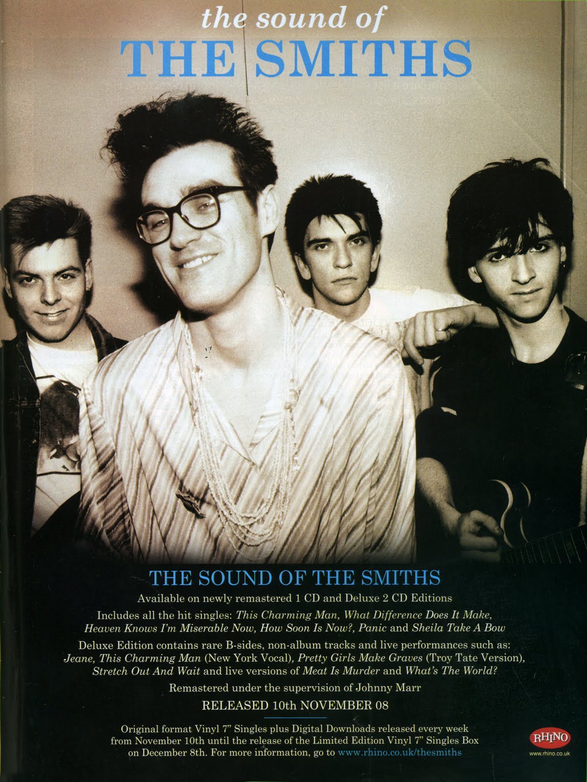
Rhys' Design
For my design, I have linked the idea of the album cover and the portrayal of the dream state to produce this graphic. For this draft, I have used an image off of Google for the man asleep at the bottom, however for our final piece, we would use the actor from our video.
Behind the sleeping man, there is an image of himself walking through the woods, in his dream. Surrounding this image are images of space nebulas and abstract shapes and textures. This enforces the idea of him being in a dream, as it is abstract and peculiar; different to his normal life.
In order to make it professional, I have included pretend reviews from famous names in order to promote the idea that this album is known by large companies and institutions.
In addition, I have included the name of the artist and the album at the top of the page. This is because, as I learnt from my research, I found that the majority of posters have the name at the top in order to suggest it is the most important and fundamental aspect of the poster.
Below this, I have put in capital letters 'OUT NOW'. This is to make it evident to the audience of the text that the album is available to purchase.

Calum's Design

My design is an image of a man walking on a road, with woods either side of him. This therefore is very similar to the actual location that we are filming the piece in and connotes the same ideas, meaning that the audience will instantly get an understanding of the location the video is set in, and how the magazine advert therefore links in with the music video. On the magazine advert, you can also see the words 'Trials of the Past' all in capital letters. This is because this is the song title, and is therefore a very important aspect of the magazine advert. By positioning it in the middle of the advert peoples eyes are instantly attracted to it. In the bottom right hand corner there is the name of the artist, along with key information regarding when the single is released. In the bottom left there is an image of the Young Turks record label sign, this is who SBTRKT is signed to and therefore is important to include in the magazine advert. Overall when I produced my magazine advert, I considered how I could use colour effectively, by having it quite dull it means the target audience can start to understand the genre of the music video and the sort of things they can expect to see in it. Also it meant that the text would then stand out against the dark background, helping it catch the eye of the audience and making them read it. The colour red also connotes blood and passion, this links in with the rather strange and eary scenes that can be seen throughout the music video.


George's Design 


This is my second idea for my magazine advert ancillary task. I believe that it is still effective, although is not as effective as my initial poster, as it does not contain as many eye catching colours. However, with this said, I do believe that this poster fits the theme of the video well, as it is dark and monochrome with an emphasis on shadows with very little colour. In addition to this, it has a level of correspondence to the album cover, as the forest on the front matches the dark theme, along with the font being similar. The only use of colour is for the text which reads "debut album out now", as in terms of marketing, this is the most important part. It is important as the music video and its ancillary products will be used in the real world in order to market an album. Finally, I have included links to websites, as these will help any potential fans to hear music by the artist quickly, and will then be able to purchase this music.

Jack's Design
 
 
This is my first attempt at a magazine advertisement. I have used Stock Images from the internet to create the same sort of gesture as our video - that a ghost will be involved with a person. I used Photoshop to create this magazine advertisement and there a lot of things which are lacking from my design. The green artist title is a difficult colour to read against the black background whereas the white is much clearer. The fonts are a bit too basic for a music magazine advertisement. The information is lacking and there is no record label logo to indicate which label SBTRKT are with. However, things which I did that I liked were the black and white effect on the 'ghost' to show he is a ghost and different from the full coloured man. I think my image choices are alright because I picked images which would connect in a way that would portray them looking at each other. They don't have a white background because I used to tools to get rid of the background. To improve the magazine advertisement I think more detailed information needs to be added and perhaps more interesting visuals.
 
Since doing the first magazine advertisement I have designed another one with much more detail and more sophisticated aesthetics.
 
I am much prouder of this magazine advertisement since I have developed my Photoshop skills. It is much better than my first one with more detail, information and better images. I have included a Young Turks logo and a quote from a music magazine to promote the single. One thing I really like which I have done is make the middle part of the title black to contrast the white and make it clearer against the background. The background of the road and the forest incorporate into the house style of all three products. Our video is based in a forest and features an abandoned road whilst our digipack also has images of trees and creepy forests on it. I used a black and white theme for the majority of the writing to match the record label logo and so it isn't too over-powering over the top of the background. However, to make the artist name stand out I used an effect which is a mix of colours to amount to something a bit different from the rest of the fonts and colours. I'm glad it doesn't clash with the background, however that is personal opinion, some people might think it does.


Wednesday 5 November 2014

COSTUMES INFORMATION

Due to our character waking up in the woods, a suitable costume for him would be pyjamas so it is obvious he has supernaturally been transported from his bed to the woods. We want our video to be ambiguous so we wont be confirming whether he has been sleepwalking or some other entity has brought him to the woods. He will be wearing long pyjama bottoms and a white t-shirt for his outfit. This is to connote the mysteriousness of why he is in the woods and how out of place he is.

This is a mock up of our outfit ideas and seeing it put together shows that it is what we want. We have additional ideas to create a few rips in the t-shirt and bottoms to show that he may have been dragged to the woods and to complete the creepy vibe which we want our video to have. The t-shirt will be muddy due to the fact our character is waking up in the woods, on the ground.
 
We have another character who will be playing the ghostly version of our main character who will be in a different outfit to show that they are two separate entities.
Our other character will be wearing all black with black eye make up to create a darker feel to him, to properly distinguish between both characters and make the narrative clearer. We want it to be clear he is a supernatural being so the all black ensemble will show that in contrast to the normal character's white t-shirt.
 
Costume planning is important because we need a set costume idea so that our plans are final and the production can go ahead.
 
By Jack Jolly


Monday 3 November 2014

PHOTOGRAPHIC STORYBOARD


We produced a photographic storyboard as it allowed us to get an idea of the sort of shots we would be using. We based the photographic storyboard on the hand drawn storyboard and the animated storyboard. This shows a series of photos that represent different images that can be used in our piece. The artist that we used isn't the actual artists that we intend on using in the actual music video, however it was more for the purposes of understanding the shots we are going to use and seeing how we can make the piece flow from one shot to another and link the images together.

We use a variety of shots. By doing this it keeps it interesting and ensures that the audience don't get bored. Also due to the amount of shots that we wish to use, we will require good editing skills, this also means that a variety of shots is essential to ensure that we don't have long continuous shots that get boring and aren't interesting to the audience.

When carrying out this task, it was beneficial to because it allowed us to use the equipment and practise different types of shots. This then means that we can take different shots and see how they would look in the music video. For example, when carrying out this task, we practised doing lens flares as we thought this may be a unique shot that we could incorporate into the music video. By doing this, we became quite good at doing them and are now planning on using this in our music video as a way of editing from one shot to another when the lens flares.

Overall, by doing this photographic storyboard, it was beneficial at getting an understanding into the sort of shots we could use and how they would look in real life, rather than just on paper and animated. It allowed us to see what shots would work, what shots we may have to re consider, and any overall improvements that we could make to our music by changing certain things and get an overall positive outcome. Therefore this was an important task and was very valuable in ensuring we can produce the best possible quality music video.

By Jack Jolly

Saturday 1 November 2014

Filming and Editing Schedule

We have designated two days to the filming of our video, although we may need to find time a few weeks afterwards to re-shoot certain parts if we decide we have not captured footage which meets our high standards. 

Monday 27th October: We have planned for this to be the day that we take various establishing shots and to organise our props within the forest. We won't be filming any of the shots which contain our actor on this day, as he has already said he is unlikely to be able to make it. It will also give us a good chance to test out the lighting rig and ensure that there are no modifications which will need to be made before the bulk of the shooting begins. We plan to begin filming at about 3pm and to finish at about 8pm, as this will give us time to get a good collection of both day and night shots, and to experiment with the lighting rig.

Thursday 30th October:  This is the day where the bulk of the filming will take place, as our actor is available for the whole day. We plan to begin shooting at around 12pm and to finish in the early hours of the morning, as we need to record a lot of footage, and to ensure that we do each shot multiple (4 or 5) times to make sure that we have the largest possible amount of footage to make the finished product from. By creating our lighting rig, we will be able to continue filming in the night, which will work to our advantage as it will show a noticeable difference between the beginning and the end of our video. 

Monday 3rd November: On this day we will begin editing at my house, using Final Cut Pro X in order to add special effects to the shots before we take them into school to string them together using Final Cut Express.

4th November-30th November: Most days during this period will be spent editing the video, with a lengthy editing process being required in order for us to make the finished product to the quality which it needs to be. After this we will be finished with the video part of the coursework meaning we will be able to focus on making a digipack and magazine advert which are of similar quality.

Update:

Due to the need to complete more pre-production work than had been initially anticipated, we decided to push all of the dates back by a couple of weeks, so I have filled out the filming diary which can be viewed below.

Shoot one 14/11/14
 
This shoot was filmed at the side of the road in Great Leighs, and is where we captured the majority of the lip syncing footage. It was filmed at night, like the rest of our video, in order to get The Blair Witch Project influenced spotlight effect on the subject of the shots. It was a dry night, which meant that we could film a lot more freely as we didn't have to worry about the camera becoming water damaged. We also filmed some footage of the road which the protagonist is going to find his way onto, as the road was quiet allowing us to film on it.
 
Shoot two 18/11/14
 
We filmed the majority of the narrative and scenic shots during this shoot, as we realised that we needed to incorporate a lot more narrative around our lip syncing in order to make the video more effective. We had to ensure that the actor was wearing the exact same costume as he was the previous night of filming, as otherwise there would be no continuity within the video. In addition to this, we filmed the shot of our actor getting run over, although this may not make the final cut in order to make our video look as professional as possible.

As we had the shots, locations, props and actors well organised, we were able to get the majority of the filming done on these two nights.
 
By George Martin 

Sunday 26 October 2014

Ideas for Magazine Advertisment

From researching into multiple magazine adverts for various music artists, I have found that there are multiple conventions which we should include in order to ensure that our magazine advert is as effective as it can be. I have listed these below, along with examples of innovative ways which we can include them.

1. Artist and album name in the largest font - This is the most important feature of the magazine advert, as this is the information which the reader needs to take away from it the most. Whilst all the other information is important, this is the crucial part, as the rest of the information is fairly useless without this part. In order to make it stand out on our advertisement, I believe it should be white, as the background of the advertisement is most likely to be black in order to match the dark theme of our video. In order to separate the artist name from the album name, we may try having one in bold and then one in normal script, for example:
                                    SBTRKT 
                               Trials of the Past

An image such as this one would make a
good basis for the magazine advertisement.
2. A picture of the album cover should take up the majority of the advertisement - The album cover we design as part of the production of the ancillary products will match the mood of our video, and so if this takes up the most space on our poster then it will be effective. By matching the theme of the ancillary products to the music video, those who have seen the video are more likely to notice the other items when they see them.  Ideas which I have had for the album cover include a fuzzy picture of the protagonist of our music video in order to match the haunted theme, or a more scenic shot of the dark woods which the video will be shot in.

3. A website, Facebook and Twitter should all be provided - These are all essential, as they provide most people with a first port of call in order to hear some of the music which is being advertised. In order to incorporate each of these, I think placing small Twitter and Facebook logos next to the names of them is an effective way, as if the social network plugging is too overstated within the advertisement, then they will begin to effect the colour scheme and make it seem unbalanced. 

4. The small-print should be kept minimal - I have found that the most effective adverts were the ones where the pictures and large text did most of the selling of the product, with the small print used in order to tell the reader about the release date, the formats which the single/album will be released, and perhaps less essential information such as which song will be on the B-side. An idea which I had for the small print of our magazine advert was to use it to say the release date, but to direct the reader to a website in order to gain more information about it.

By George Martin
 

Tuesday 21 October 2014

Films and Music Videos for Inspiration

Due to our unanimous decision to make our music video in quite a creepy way due to the lyrics and genre of the music, biggest inspirations will come from horror films and other genres like Science Fiction, Mystery and Drama.

For example, Donnie Darko will be a main intertextual reference for our music video because our plot is similar to the beginning of the film. Our character will wake up outside in the woods and not know where he is or how he got there, much like Donnie at the beginning of Donnie Darko.

The film opening shows Donnie waking up lying on the road near the forest, much like our initial ideas for our film. We are however thinking of having our main character wake up in the actual forest rather than near it.
I like this shot of the back of the characters head, showing the location and him looking into the distance. It's artistic value is something I would like to replicate for our own music video.


Radiohead's No Surprises is another influence for our music video because the fact that it only stars one character. However this isn't very relevant to our music video because this music video is completely performance based with the whole video being lip-synced. We plan to have a narrative element to our video which creates a more detailed and in-depth music video.

Another strong influence is Cosmic Love by Florence + The Machine.

The second shot on our storyboard is a close up of our main characters eyes opening. This can also be seen in Cosmic Love.
Florence's eyes open to the beat of the music while in a close up. This idea has already been planned in our storyboard and now I have witnessed it being used and worked well I will ensure we include it.
The music video also features similar ideas that we have had in mind, for example, the use of foliage and the mystery of walking through natural settings.

This post has helped us because to gain ideas for our music video we need to have inspiration from other existing music videos. As well as this, we have seen some of our ideas from our music video being used in existing music videos, validating our ideas and encouraging us to experiment with them.

By Jack Jolly